Layout
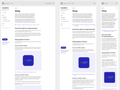
Responsive design
Responsive design means your layout adapts to different screen sizes instead of staying fixed. It is about making sure your content looks good and works well on phones, tablets, laptops, and big monitors.
Design used to have fixed boundaries
Before screens, every design had a fixed size. Think of them like paintings. Leonardo da Vinci worked with a 30 by 21 inch canvas. He filled that space, and it never changed. Everything had a fixed position and size.
Today, our canvas is the screen and that screen can be any size. Your job is to make your design look good on all of them. To do that, you need more than just sizing and positioning. You need to understand the tools that help your layout adapt.
Now we deal with breakpoints
Breakpoints are different screen widths where your layout can adjust.
In the Framer editor, you see breakpoints lined up next to each other. One of them is always the default (usually desktop) and that one affects all others. If you make changes on a smaller breakpoint, those stay local and do not affect even smaller viewports.
You can create as many breakpoints as you want, but honestly, the three that Framer suggests out of the box are good enough for most use cases.
In special cases, like advanced grid layouts, you might want to add a larger breakpoint, for example, if you want to show six columns instead of three above 1600 pixels.

Layout options
You can tweak several values in the Layout panel to get the result you want. Let’s go through them one by one.
Type
What looks like a layer in the left panel is actually a div under the hood. Just a regular HTML element. In Framer, these divs are used to build stacks and grids.
A stack places elements next to or below each other, depending on the direction. A grid arranges them in rows and columns, based on how many you set.
So yes, it looks like layers, but it behaves like structured layout. Makes sense now, right?
Stack
Grid

Direction
Defines whether elements are laid out horizontally or vertically inside a stack. You can switch this per breakpoint for responsive layouts.
You will use this often to control how content flows on different screen sizes.
Horizontal
Vertical

Distribute
This controls how elements are spaced inside their parent, whether they sit at the start, in the center, or at the end of the container. It follows the direction you set above, so distribution happens horizontally or vertically depending on that setting.
There are also some less obvious but powerful options, like Space Between, which pushes the first and last elements to the edges and leaves space between.

Align
Sets how elements align inside the parent. The available alignment options depend on the layout direction. So you will be aligning either horizontally or vertically based on the direction you set above.

Wrap
Lets elements move to a new line if they do not fit in one row. Especially helpful when working with tags, buttons, or dynamic content.

Gap and Padding
Gap controls the space between elements. Padding controls the space inside the container.
While these settings are not required for a layout to be responsive, they make a big difference in how your design feels on different screens. Think of it this way: bigger screens usually need more padding, while smaller screens feel better with tighter spacing. It helps your layout breathe.

Additional layout techniques to keep in mind
Beyond sizing, positioning, and alignment, there are a few extra techniques that help your layout respond better. These include how you control content order, visibility, scrolling, and overflow.
Content order
In the layer panel on the left, you can change the visual order of elements without changing their actual layer structure. This is especially useful when you want to rearrange content for mobile without affecting the desktop version, or vice versa.
1st on Desktop
3rd on Mobile
2nd on Desktop
1st on Mobile
3rd on Desktop
2nd on Mobile


Visibility
Use visible or not to hide or show elements at specific breakpoints. This is useful for showing simpler versions of content on smaller screens.

Overflow
Controls whether content inside a container is clipped, visible, hidden, or scroll.
By default, overflow affects both directions. But if you need more control, you can adjust the X or Y overflow separately using the + button in the Styles panel.
One thing to watch out for: when overflow is set to visible, the browser uses the size of the largest overflowing element to calculate the page width. This can cause the rest of your layout to shrink, especially on mobile breakpoints. If your layout suddenly looks too small, chances are something is sticking out past the edge of the screen.
Is it too big for this container?

Overflow: Scroll
Sometimes you want content to overflow a container, especially on mobile. That’s where scroll comes in.
It lets you scroll content inside the parent, without making the entire page scrollable.
To enable this:
Set Overflow to Scroll
Use the + button to define the scroll direction (Overflow X or Y)
Optionally, turn on Overscroll: Contain to prevent bounce effects
And if you want to hide the scrollbar (like on most mobile designs), toggle Scrollbars: Hidden
Is it too big for this container?
Scroll right

One last thing to remember
On mobile and tablet, your cursor is your finger, which means there is no hover. Even though hover effects can add great UX on desktop, you need to handle them differently on touch devices. Always make sure that hover-only interactions are backed up by something that works on tap as well.