Globals
Vectors
This one’s short and you’re going to love it.
Vectors are perfect for managing icon sets and making variables easier to use. But more than that, any SVG-based element on your site (like logos) should ideally live here.
Why use Vectors?
Vector illustrations stay razor sharp on all screen sizes and pixel densities. They’re tiny in file size and load super fast.
They shine especially when you’re using lots of icons. You can easily drag them onto the canvas or even bind variables to keep things consistent and flexible at the same time.
You’ll find the Vectors panel under the Assets tab in the left sidebar.
Getting started
Use the plus icon in the Vectors panel to create your first set. Then switch to the Layers tab to see the familiar interface. You’ll see three default examples. Keep the first one and delete the rest.
Icons are placed on small canvases inside the set. It's best to give each canvas the same dimensions, and make sure all icons are sized similarly (e.g. same height) with a bit of padding from the canvas edge.
Framer expects SVG files. You can paste or drag them directly onto a canvas. Make sure each canvas holds only one icon.
Quick prep for flexible use
To make your icon set as useful as possible, connect variables to properties like fill (color) and stroke width. This lets you control them directly from the editor, even inside a component.

Using icons on the canvas
Once your set is ready, you can drag it into your page. Set its size, then use the dropdown to pick which icon to show.
If you’ve set up variables, you’ll be able to tweak values right from the component or the canvas.
Need to replace an icon you’ve already used in a bunch of places? No worries. Just update it in the Vector set, and it will refresh everywhere automatically.

Using vectors inside components
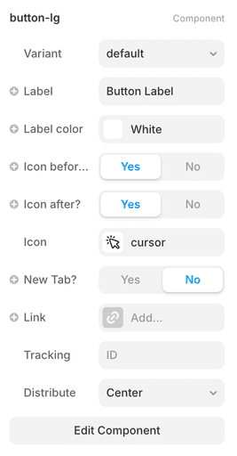
For buttons, this setup is especially useful.
Here’s my go-to setup: Create a button component with three elements:
'icon-before - label - icon-after'.
You can connect variables to each. That way, you can customize it per use case: Sometimes you want an icon before the label, sometimes after, and sometimes no icon at all.
With vectors, this stays clean, scalable, and consistent.